

Product information tabs
General Option
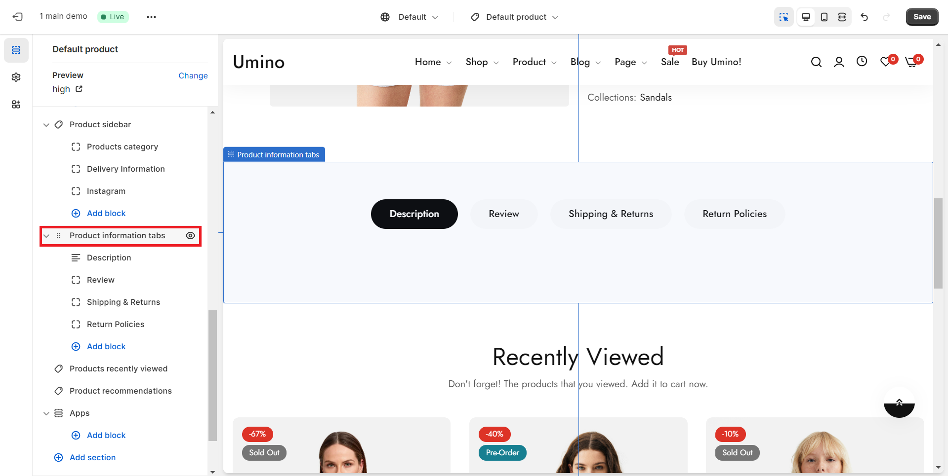
.png)
Layout: There are 3 types of layout Container, Fluid container, and Full-width.
Color schema: You are allowed to change text color, background color with preset color.
Custom class: Facilitate customers in incorporating a new HTML class within the HTML code for Product Information tabs.
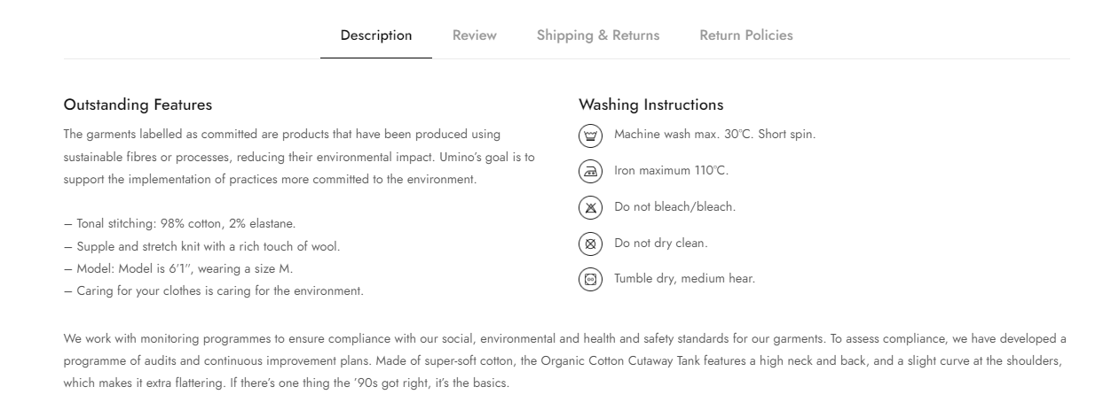
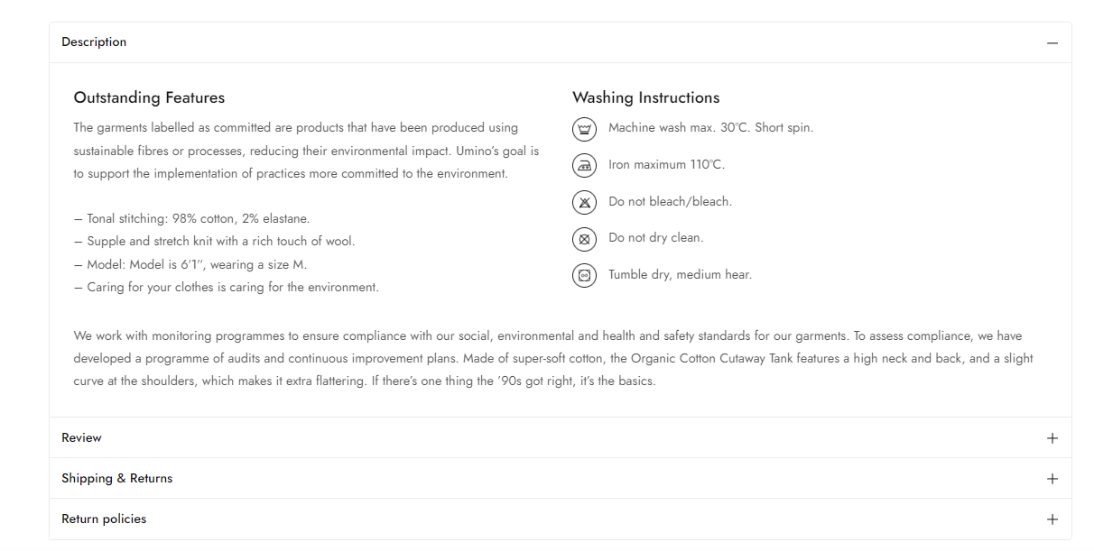
Design: There are 3 types of product tab: Tabs, Accordion and Show open all.
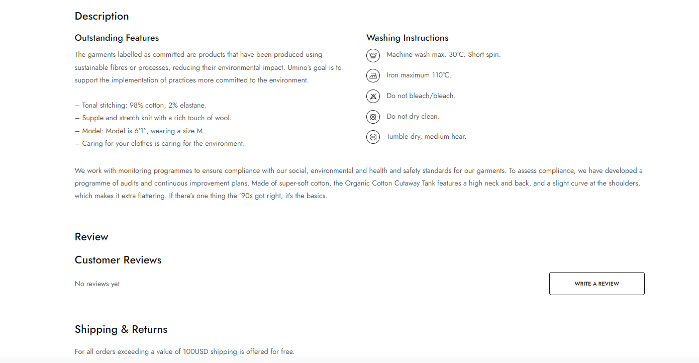
Position (only for accordion): There are 2 options Product content external and Product content inner.
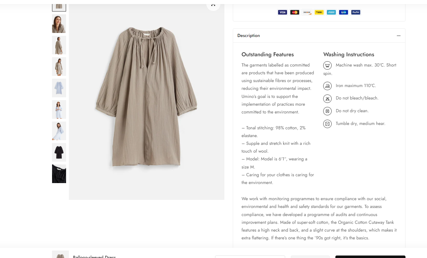
Enable show two columns: Display the description in a two-column layout instead of full-width, offering a visually pleasing presentation.
.png)
Add blocks for Product Tabs
The Product Tabs option has a total of 3 blocks for you to add to the sidebar:
You also have the ability to arrange the position of blocks through drag and drop.
When you click on each block, it will show the settings sidebar (of each block).
No comments yet