

Product information
This article guides you through the process of adding, editing, or removing information on your product pages. Providing accurate, reliable, and comprehensive product details empowers customers to make informed purchasing choices.
How to add a Product information section?
Steps
- In the theme editor (Customize), open the template selector.
- Select Products, then Default product.
- On the left-sidebar, add Product information.
- Make necessary changes > Save.
How to customize your Product information section

General Settings

| Setting | Description |
|---|---|
| Section width | 3 options for container |
| Color scheme | Select colors from Theme settings -> Colors |
| Enable sticky add cart on desktop | Keeps the Add to Cart button visible while scrolling on desktop for easier access. |
Media
Learn more about media types.

| Setting | Description |
|---|---|
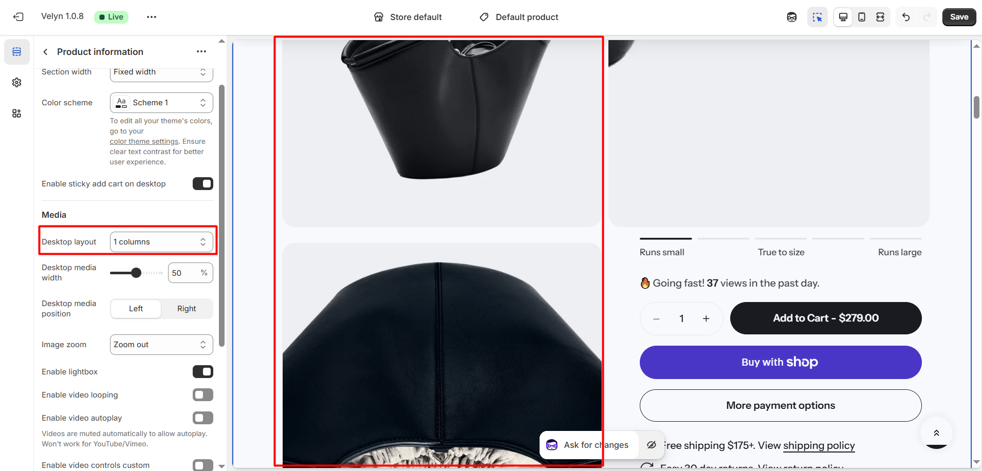
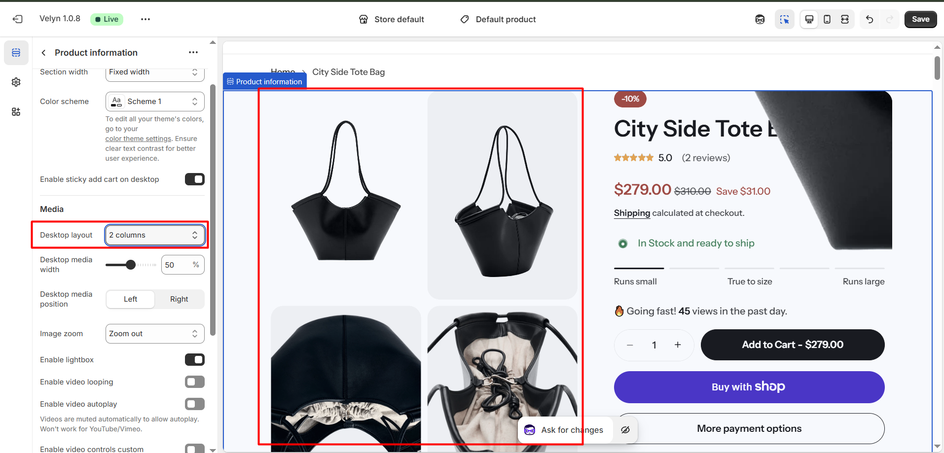
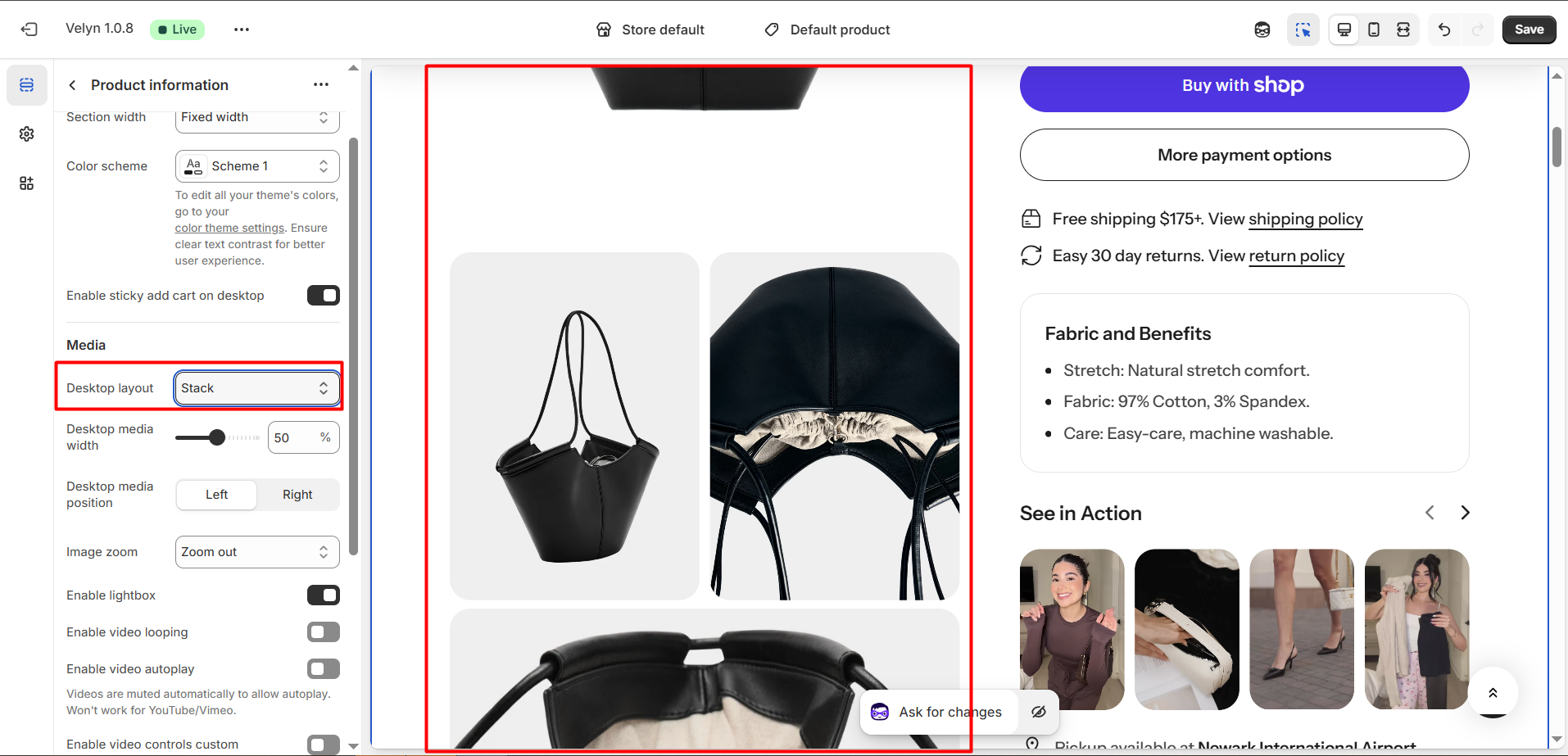
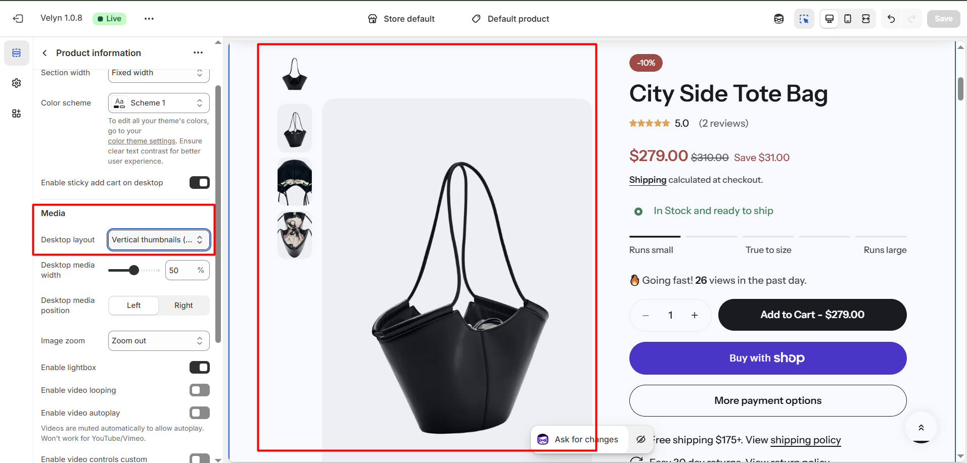
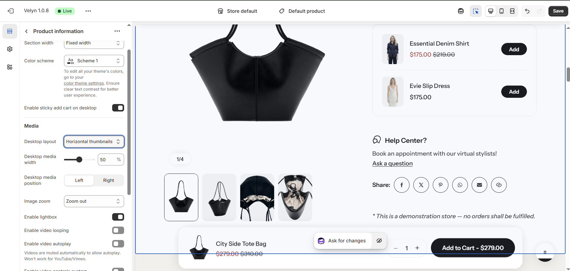
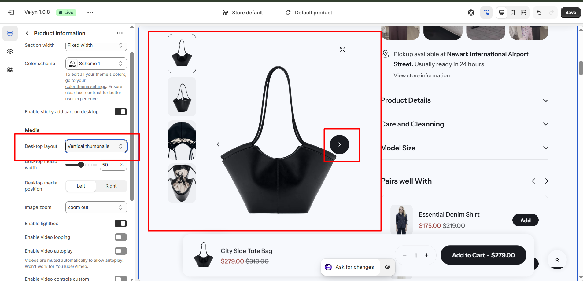
| Desktop layout | 3 options for desktop layout
|
| Desktop media width | Adjusts the width of the product media (images or videos) on desktop *Note: Media is automatically optimized for mobile. |
| Desktop media position | 2 options for desktop media position
*Note: Position is automatically optimized for mobile. |
| Enable image zoom | Allows customers to zoom in on product images for a closer view when hovering or clicking, depending on the theme behavior. |
| Enable video looping | When enabled, the video will loop if the product has a video |
| Enable video autoplay | When enabled, the video will autoplay if the product has a video *Note: Videos are muted automatically to allow autoplay. Won't work for YouTube/Vimeo. |
Section padding

| Setting | Description |
|---|---|
| Top | Customize the top margin of the section |
| Bottom | Customize the bottom margin of the section. |
Block settings
We provide plenty of useful components for you to customize your own template:
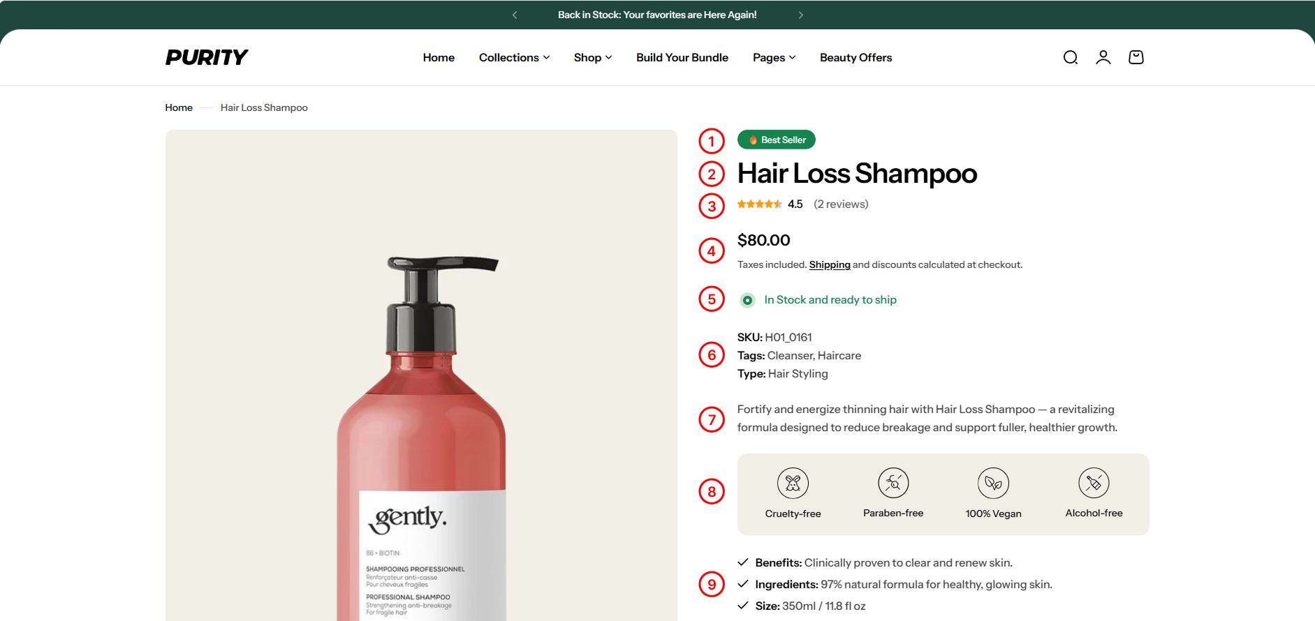
1. Badge
Displays product tags. To learn more about badge and how to add it to your store, visit the following link .
2. Product Title
Display product title.
3. Product rating
Display the product's rating.
4. Price
Display product price.
5. Inventory status
Inventory status signifies the availability of a product. It's vital for ensuring products are in stock, managing inventory efficiently, and informing customers about availability on your website.

| Setting | Description |
|---|---|
| Low inventory threshold | Set the number of items left to trigger a “Low stock” alert. |
| Inventory base quantity | Set the starting stock quantity to display the progress bar correctly. |
6. Product meta
Show/hide collections, SKU, product type, and product tags.

7. Description
Detailed product description. To learn more about description and how to add it to your store, visit the following link .
8. Highlights
Show key product benefits using icons and short labels. To learn more about highlights and how to add them to your store, visit the following link .
9. Key features
List the key benefits of the product. To learn more about key features and how to add them to your store, visit the following link .
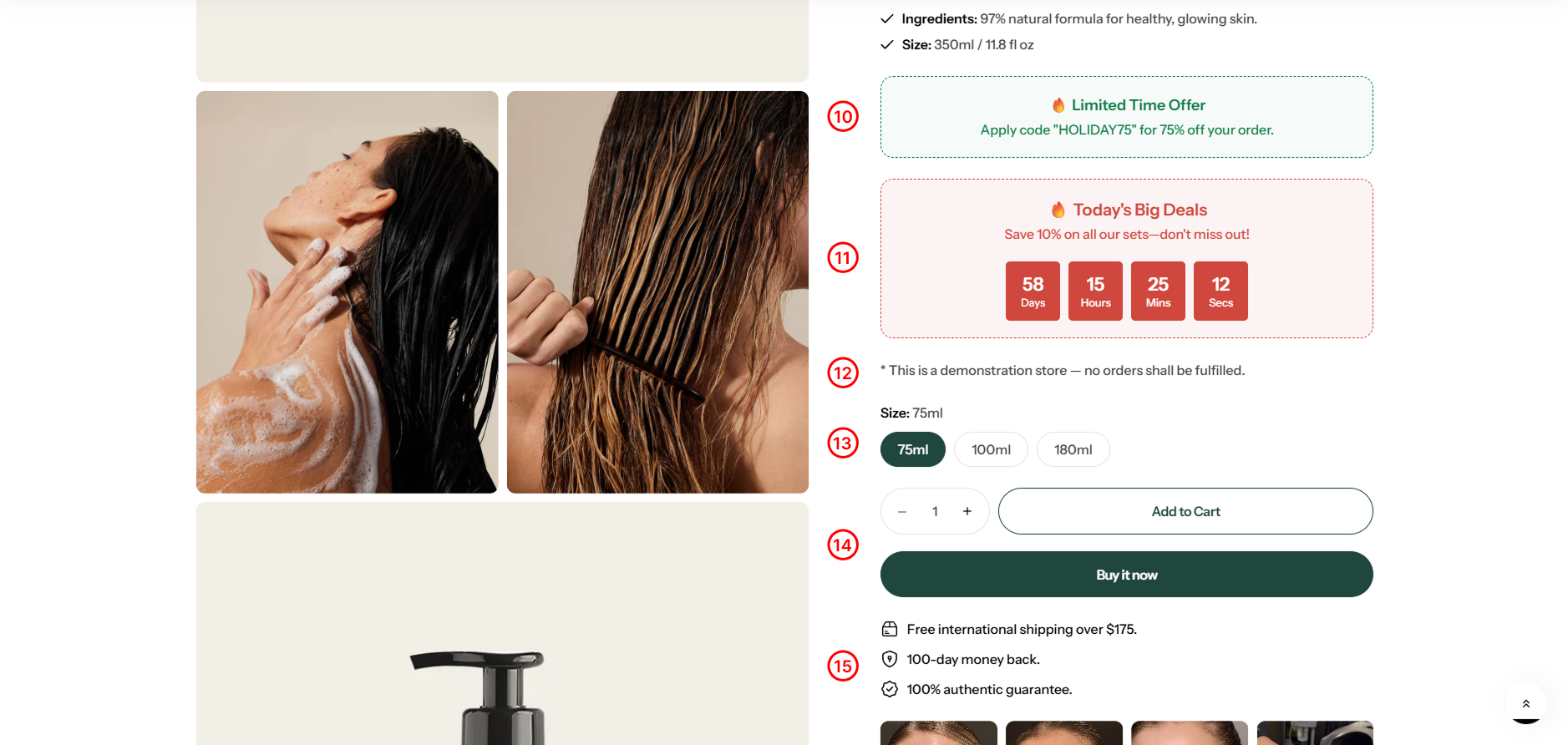
10. Promotion alert
Displays promotional messages (e.g., 🔥 Limited Time). Fill in the settings:

11. Promotion countdown
Display the promotion countdown.
You need to create a metafield before displaying this block. Please see how to create a metafield here .

12. Text
Add the custom content you want.
13. Variant picker
Products with variants provide customers with more choices. To learn more about variants and how to add them to your store, visit the following link .


| Setting | Description |
|---|---|
| Type | Pills and Dropdown |
| Show size chart | Display size chart |
| Show size recommendation | Display a modal that allows users to enter information and receive size suggestions. You can see how it works here |
| Size trigger | Define the label(s) used for size options. Separate multiple names with commas. |
| Size chart label | Title of size chart. |
| Size chart page | Select the page to display the size chart you've created. |
| Footer content | Add custom text or links to provide additional information, such as support options or important notices, in the footer section. |
| Custom size chart | Using specific size charts for each collection or product.To use a custom size charts for product or collection, create metafield with namespace and key: "custom.size_chart". Learn more |
14. Buy buttons

| Setting | Description |
|---|---|
| Show dynamic checkout buttons | Toggle the ''Show dynamic checkout buttons" option to include a direct checkout button |
| Show recipient information form for gift card | Enables users to schedule gift card deliveries with personal messages. Learn more |
You can change the "add to cart" button to an "External/Affiliate" button by following the instructions here .
15. Icon with text
Use this block to show a small icon with a short message — like free shipping, secure checkout, or money-back guarantee.

| Setting | Description |
|---|---|
| SVG Icon | Choose an appropriate icon |
| Text | Write a short text. |
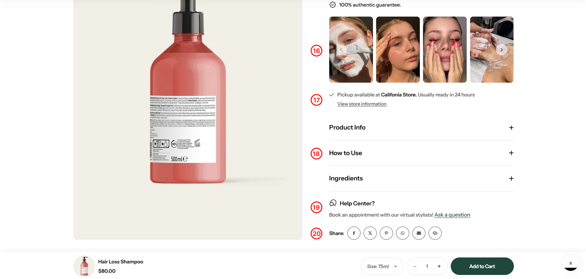
16. Media lightbox
Display images or videos in a carousel. To learn more about media lightbox and how to add it to your store, visit the following link .

| Setting | Description |
|---|---|
| Items per row on desktop | Set the number of items to display per row. |
| Show navigation | Enable arrows to move between items. |
| Show pagination | Show dots to indicate item locations |
17. Pickup availability
Show customers if a product is available for local pickup at a nearby store or location.
18. Accordion row
Add a heading and extra information on the tabs.

| Setting | Description |
|---|---|
| Heading | Include a heading that explains the content. |
| Row content | The content, as you've written. |
| Row content from page | The content is get from the selected page. |
19. Accordion row drawer
Add a heading and extra information on the tabs. The content will be then displayed in a popup.
| Setting | Description |
|---|---|
| Heading | Include a heading that explains the content. |
| Row content | The content, as you've written. |
| Row content from page | The content is get from the selected page. |
20. Ask a question
Display a form for users to submit questions to the seller about the product.

21. Share
Display social networks for sharing or copying links to share.
22. Complementary products
To select complementary products, add the Search & Discovery app. Learn more

You need to create a metafield before displaying this block. Please see how to create a metafield here .

23. Model size

You need to create a metafield before displaying this block. Please see how to create a metafield
24. Product sizing

Helps customers understand how the product fits and choose the right size with confidence., visit the following link .
25. Live view

26. Notify product re-stock
27.Stock countdown

28. Subscription widget

29. Subscription widget
Show the required safety warnings and regulatory notices for a product, in a card of collapsible rows near the rest of the product information. Use it for content you are obliged to show, for example a safety warning, an age restriction, or a compliance notice.

The text itself does not live in the theme. It comes from Shopify's own product disclosures, which you add to the product in Shopify admin. Please kindly refer to our instructions [ here ]
No comments yet