

Header
The Header on an e-commerce website enhances user experience by providing easy navigation, reinforcing branding, enabling quick search, displaying cart previews, offering contact information, showcasing promotions, and ensuring a consistent, user-friendly design across all pages.

1. Header settings
General settings
Customize the overall layout, color scheme, logo position, and header behavior for your section.
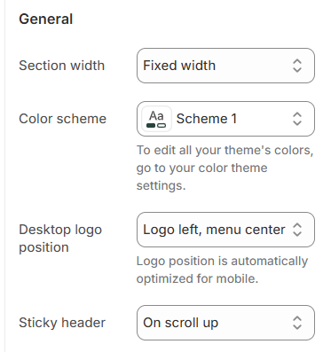
| Setting | Description |
|---|---|
| Section width | 3 options for container |
| Color scheme | Select colors from Theme settings -> Colors |
| Desktop header layout | 5 options position logo desktop |
| Sticky header | 3 options sticky |
Menu
Customize your site's main menu by selecting a menu and configuring how the desktop dropdown menu is triggered, as well as the dropdown animation style.

| Setting | Description |
|---|---|
| Menu | Select which menu will be used as the main navigation for your site. |
| Desktop dropdown menu trigger | Choose how the dropdown menu on desktop is triggered — either by clicking or hovering over the menu item. |
| Dropdowns animation | Select the animation style for the dropdown menus when they appear. |
Mobile menu settings
Add a banner image and link to enhance your mobile menu experience.

| Setting | Description |
|---|---|
| Hamburger icon position | Choose where the hamburger menu appears on mobile. |
Addons
Addons offer additional settings for the header, including features like search, currency selector, language selector, and more. Enable the relevant checkboxes to activate them.
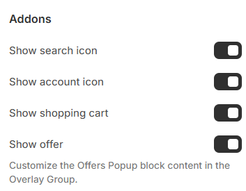
| Setting | Description |
|---|---|
| Show search icon | Display a search icon in the header for quick product searches. |
| Show account icon | Show an account/login icon in the header. |
| Show shopping cart | Enable the shopping cart icon in the header. |
| Show offer | Enable the offer icon |
Country/language selector

To add a country/region, go to your market settings. . To add a language, go to your language settings.
| Setting | Description |
|---|---|
| Show currency | Display country/region selector |
| Show language | Display language selector |
Transparent header
A transparent header is a see-through top section on a website or mobile app, allowing the content or background to show through instead of having a solid color background.
Ensure the first section on your homepage is configured as one of the following: a Slideshow, a Video with a text overlay, or an Image with a text overlay.

| Setting | Description |
|---|---|
| Enable transparent header | Display as transparent only on the homepage |
| Text and icon | Customize the color of text and icons in transparent header format |
Section padding

| Setting | Description |
|---|---|
| Top | Customize the top margin of the section |
| Bottom | Customize the bottom margin of the section |
2. Block settings
Banner ( Mega menu )

| Setting | Description |
|---|---|
| Menu item | Enter the name of the level 1 menu to display the mega menu dropdown. Please distinguish between uppercase and lowercase letters. |
| Desktop menu columns | Choose the number of column |
| Width | Adjust the width of each banner as a percentage of the total container. |
| Number of columns | Set how many banners are displayed per row. |
| Content position | Select the position of the banner content, either below the image or overlayed on the image (top, middle, or bottom). |
| Content alignment | Set the horizontal alignment of the content (left, center, or right). |
| Image | Upload or select the banner image. (448px x 260px recommended) |
Product ( Mega Menu )

| Setting | Description |
|---|---|
| Menu item | Enter the name of the level 1 menu to display the mega menu dropdown. Please distinguish between uppercase and lowercase letters. |
| Desktop menu columns | Choose the number of column |
| Width | Adjust the width of the product display area (%). |
| Number of columns | Set the number of product columns to display. |
| Heading | Enter a title for the product section. |
| Products | Select the products you want to display |
Collection ( Mega Menu )

| Setting | Description |
|---|---|
| Menu item | Enter the name of the level 1 menu to display the mega menu dropdown. Please distinguish between uppercase and lowercase letters. |
| Desktop menu columns | Choose the number of column |
| Width | Adjust the width of the collection display area (%). |
| Number of columns | Set the number of collection columns to display. |
| Heading | Enter a title for the collection section. |
| Collections | Select the collections you want to display |
Menu highlight

| Setting | Description |
|---|---|
| Menu items to highlight | Define which menu items to highlight with the selected color and icon. |
| Highlight color | Define a color to highlight your menu items. |
| Highlight icon | Select an icon to show next to the menu items. |
No comments yet