

Product tabs
The Product tabs section allows you to create multiple tabs, each with a corresponding collection, providing a dynamic way to display content.
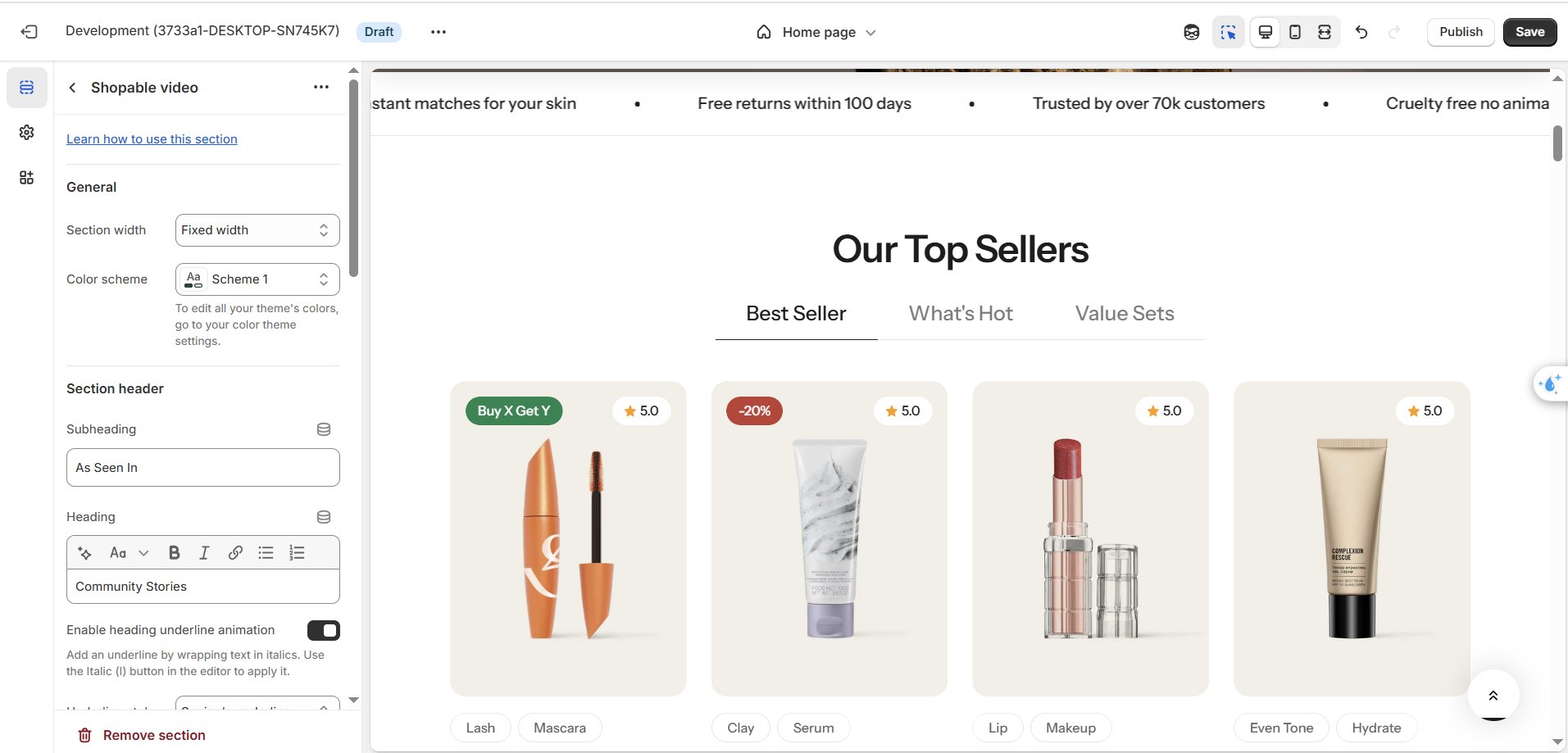
Section settings
General settings
| Setting | Description |
|---|---|
| Color scheme | Select colors from Theme settings -> Colors |
| Subheading | Subheading content |
| Heading | The title of the section |
| Enable heading underline animation | Enable heading underline animation |
| Underline style | Select Underline style |
| Underline color | Customize Underline color |
| Description | The description of the section |
| Heading size | The size of the title: |
| Alignment | The position of the heading and description. |
Carousel settings
| Setting | Description |
|---|---|
| Maximum items to show | Limit the display of the number of posts. Minimum: 2. Maximum: 12. |
| Items per row on desktop | Number of columns to display on desktop. |
| Column gap | 4 options for column gap |
| Show navigation | Display the next and back controls for the carousel |
| Show pagination | Display the pagination for the carousel |
| Reveal next slide | Display a part of the upcoming slide. |
Mobile options
| Setting | Description |
|---|---|
| Items per row on mobile | Number of columns to display on mobile devices. |
Block setting
| Setting | Description |
|---|---|
| Show view all button | Show view all button |
| Hide tab description on mobile | The description on every tab will be hidden on mobile devices |
Section padding
| Setting | Description |
|---|---|
| Top | Customize the top margin of the section |
| Bottom | Customize the bottom margin of the section |
Block settings
| Setting | Description |
|---|---|
| Collection | Select the collection you want to display |
| Title | Title of each tab |
| Description | Description of each tab |
No comments yet