

Shop by outfit

Section settings
General settings
| Setting | Description |
|---|---|
| Section width | 3 options for container |
| Color scheme | Select colors from Theme settings -> Colors |
Section header
| Setting | Description |
|---|---|
| Heading | The primary text element used to introduce or label the content within this section. |
| Enable heading underline animation | Enable heading underline animation.Add an underline by wrapping text in italics. Use the Italic (I) button in the editor to apply it. 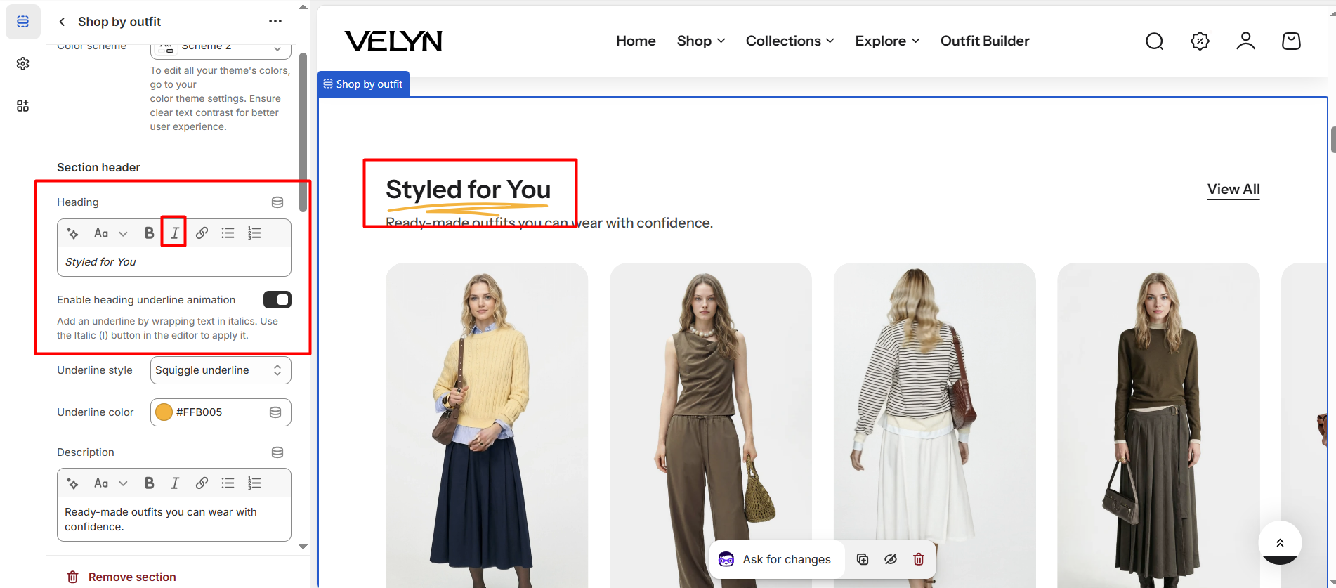
|
| Underline style | Select Underline style |
| Underline color | Customize Underline color |
| Description | A text element used to provide additional details or supporting information related to the heading or content of the section. |
| Heading size | The size of the title:
|
| Alignment | The position of the heading and description.
|
| Show view all button | Displays a call-to-action button that links to the full collection associated with the section. |
Content settings
| Setting | Description |
|---|---|
| Image ratio | The image ratio for the featured images of the blog posts: |
| Video auto play | When enabled, the video will automatically start playing as soon as the page loads, without requiring any user interaction. |
| Items per row on desktop | Number of columns to display on desktop computers. Minimum: 2. Maximum: 4. |
| Column gap | 4 options for column gap |
Carousel settings
| Setting | Description |
|---|---|
| Show navigation | Display the next and back controls for the carousel |
| Show pagination | Display the pagination for the carousel |
| Reveal next slide | Display a part of the upcoming slide. |
Mobile settings
| Setting | Description |
|---|---|
| Items per row on mobile | Number of columns to display on mobile devices. |
| Hide description on mobile | When enabled, the description content will be hidden on mobile devices to keep the layout clean and improve the user experience on smaller screens |
Section padding
| Setting | Description |
|---|---|
| Top | Customize the top margin of the section |
| Bottom | Customize the bottom margin of the section |
Section divider
| Setting | Description |
|---|---|
| Show divider | Toggles the visibility of a horizontal divider line within the section. |
No comments yet