

Theme block - Media with text
The Media with text block displays an image or video alongside a text area, allowing you to combine visuals with messaging in a flexible layout. This block is ideal for highlighting product features, sharing brand stories, or drawing attention to special offers.
General settings
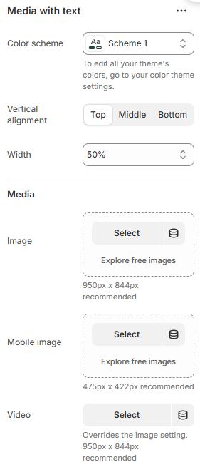

| Setting | Description |
|---|---|
| Color scheme | Select colors from Theme settings -> Colors |
| Vertical alignment | 3 options for the content alignment |
| Width | Customize the size of this block |
| Image | Upload desired image to display on desktop (950px x 844px recommended) |
| Mobile image | Upload desired image to display on mobile (475px x 422px recommended) |
| Video | Upload desired video to display instead |
| Content position | Adjust the content position: |
| Content alignment | 3 options for the content alignment |
| Overlay opacity | Adjust the visibility of the image. |
| Desktop content position | Adjust the content position on desktop. |
Block settings
Heading, Subheading, Description

| Setting | Description |
|---|---|
| Heading, Subheading, Description | Custom title block |
| Width | The width of text block: |
| Typography - Preset | Choose a preset style (font, size, weight) from Theme settings → Typography. |
| Background | Toggle ON to enable a background area behind the text. |
| Background color | Select the color for the text background. |
| Corner radius | Adjust the roundness of the background corners |
| Padding top/bottom | Adjust these values to control the amount of space between the section’s content and its outer edges. |
Button

| Setting | Description |
|---|---|
| Button label | Customize button name, or leave it empty to hide the button |
| Button link | The link URL you want to add |
| Type | The style of the button |
| Open link in new tab | Open the link in a new browser tab |
| Spacing bottom | Spacing between the button and the next component |
Highlight text

| Setting | Description |
|---|---|
| Subheading | Custom title block |
| Size | The size of highlighted content |
| Select icon | Choose the icon to show along with the highlighted content |
| Background color | Setting the background color |
| Text color | Setting the content color |
| Uppercase | Uppercasing the highlighted content |
| Spacing bottom | Spacing between the highlighted content and the next component |
No comments yet